Brand Design and Creation - iHam
 Web Guru Awards Site of the day
Innovative brand modernizing the premium Iberian concept.
Web Guru Awards Site of the day
Innovative brand modernizing the premium Iberian concept.

Full development for the iHam project, covering brand creation, graphic applications, packaging, custom illustrations, and website.
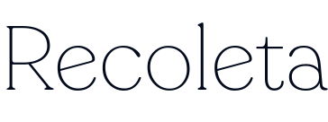
At Several, we crafted a brand for a unique and innovative concept within the Iberian world, reinventing this classic product targeted at a more refined audience and bringing it closer to everyday consumers to discover the quality of a premium product. That’s why at Several, we created a unique custom font for the logo based on Recoleta, giving it a friendlier character while maintaining the premium essence of Spain’s flagship product.



HELVETICA AND RECOLETA
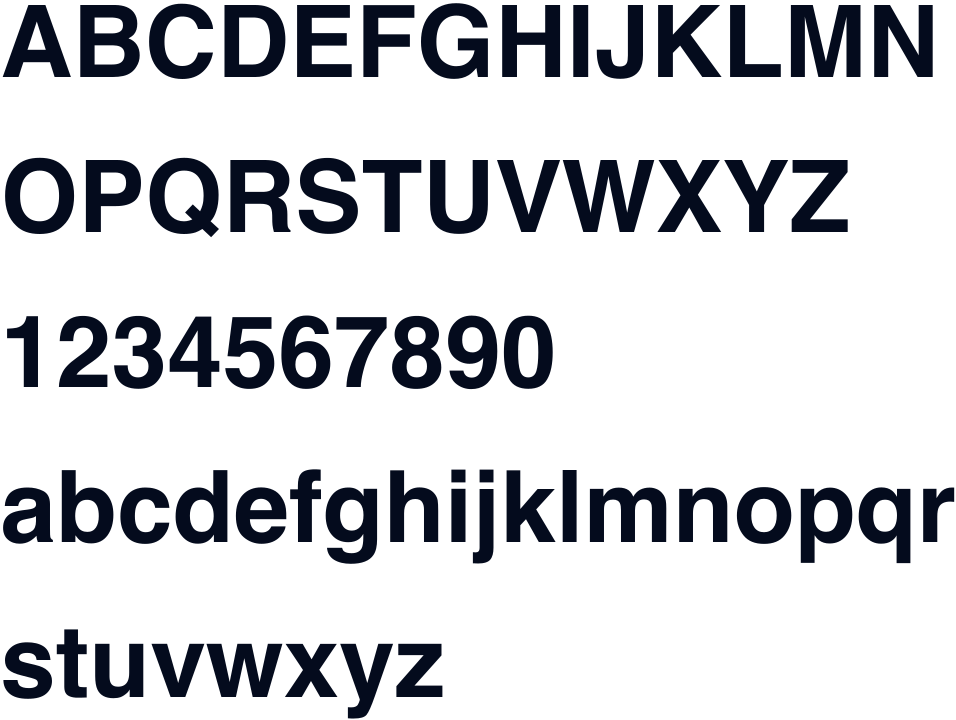
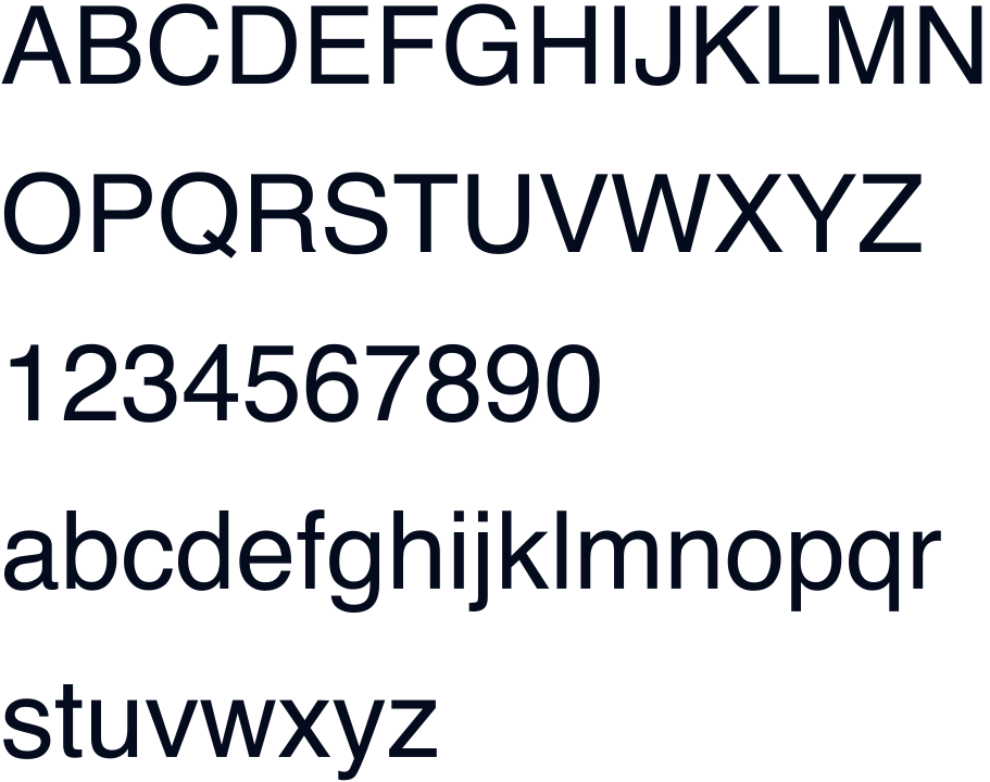
We used Recoleta for a large part of the project, focusing on the titles and the logo. Recoleta is a modern typeface designed by Jorge Cisterna in 2018. It is inspired by neoclassical architecture and Swiss graphic design of the 1950s and 1960s. Characterized by its curved and elegant shapes, it is the perfect candidate to be part of this project. For descriptions and secondary texts, the well-known Helvetica has been used.




We created a unique, personalized online store that reflects the brand’s aesthetic values, featuring playful illustrations that become part of the aesthetic world dominated by the main brand iHam, where we see the king of the dehesa offering his products under a high-quality delivery concept.


In today’s world, social media is essential for any brand that wants to connect with its audience, especially when image and aesthetics are key, as with iHam. At Several, we developed a set of graphic applications tailored to provide our clients with a solid foundation to effectively convey their brand’s essence through social media with illustrations and sample posts. Thanks to these applications, the social media team can produce engaging and consistent content that enhances brand visibility and audience engagement.


From the start, iHam has aimed to stand out from competitors not only through its unique product concept and delivery but also by caring for every detail with respect for the environment. That’s why iHam invested significant time and effort in selecting materials that emphasize natural brown tones with white illustrations and logos, creating a calm and refined feel that bold colors couldn’t convey.


“What stood out to us the most was the agency's commitment to clear communication and a personalized approach at every project phase. They truly listened and brought innovative ideas to the table, transforming our vision into a reality that exceeded our expectations in design and functionality. Their adherence to deadlines and adaptability was also remarkable, making our collaboration exceptionally positive.”