Buy Power Brand Creation
Brand restyling with a symbolic logo of growth and success.
Brand restyling with a symbolic logo of growth and success.

Graphic design and complete brand development for Buy Power, focused on increasing profits for large companies through audits and situation analysis.

For this graphic project, we carried out a complete brand restyling, starting with a brief where we clarified all the goals of Buy Power, both conceptual and professional. We applied all these foundations to the logo creation, where we also reflected the brand’s values: guiding the client towards their profit growth objectives. That’s why the shape of the symbol resembles a mountain, which the client and Buy Power climb together, placing their flag at the summit as a symbol of having achieved their goal. The mountain is divided into several parts, evoking a flag waving in the wind.


We hold an initial meeting to learn about your project, listen to your needs, and understand your goals. We analyze the starting point, address any questions, and establish the foundation for a close, transparent, and effective collaboration.

Based on the information gathered, we define a work strategy tailored to your project. We set priorities, phases, timings, and objectives to ensure the development progresses in an organized, efficient way and stays fully aligned with you.

Before moving on to the final design, we organize the user experience through wireframes and visual proposals. We define the architecture, navigation, and content layout to create a website that is clear, attractive, and easy to use.

We integrate a strategic perspective from the very first phases of the project. We work on the structure, content, performance, and technical aspects needed for the website to be ready to rank, convert, and grow from day one.

Before publishing, we review technical functionality, responsive adaptation, forms, speed, and all key website elements. Once validated, we execute the launch and provide support to address adjustments, questions, or later needs.

After launch, we analyze website behavior and identify opportunities for improvement. We review data, performance, and objectives to continue optimizing the project and support its growth as your business evolves.


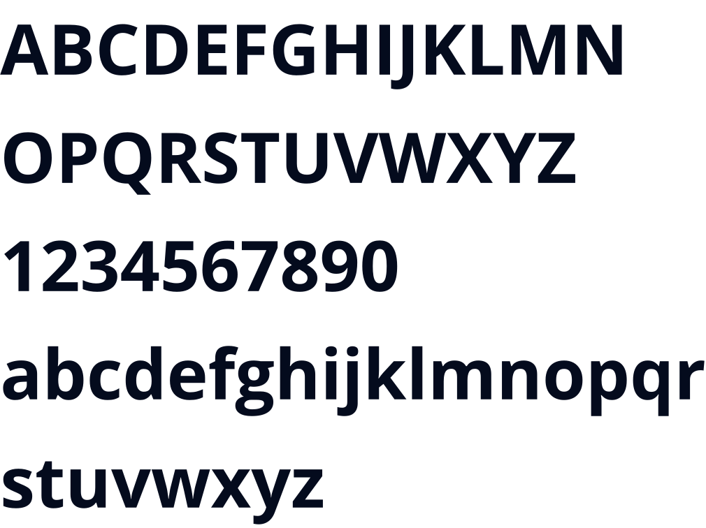
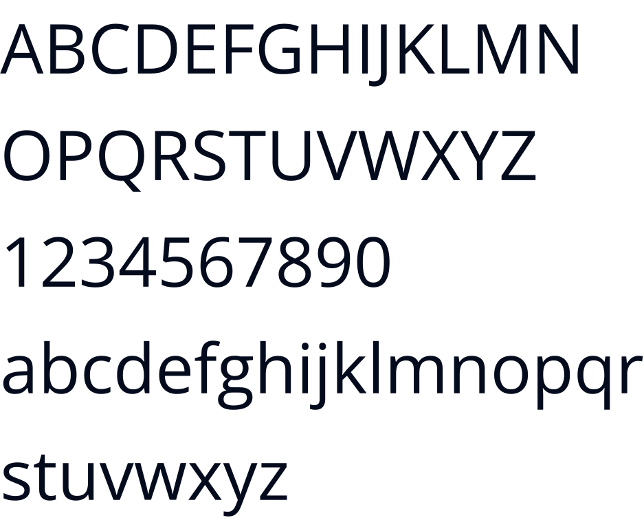
OPEN SANS AND ORKNEY
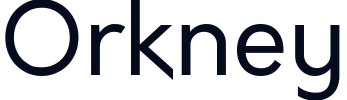
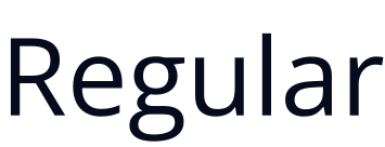
For the project, we used Orkney as the main typeface for the representation of the logo and headlines throughout the development of the brand, a sans serif typeface created by designer Samuel Oakes. Known for its geometric style and elegant simplicity, it is perfect for this minimalist and modern design. Its legibility made it the ideal font for this branding and editorial design project. As a complementary typeface, we use the famous Open Sans, which is simple, legible and provides peace of mind and makes it easy to read.


“The professionalism and approachability of the Several team.”